Observability across the IT app landscape using Celonis
It is proven that Celonis can mine data to map business processes. Features such as variant explorer & knowledge models provide the capability to analyze the process deviations and a transparent view for users to take vital business decisions.
In a typical process mining engagement, the mining is limited to the source system or a set of source systems where the actual transaction audit logs persist, depending on the process implementation.
But, why limit to only the source system transaction logs? Vital insights can be gathered from user experience logs, API logs, Infrastructure logs etc. Business leaders and IT leaders today are more keen to get an end-to-end view of how a process threads through their IT app landscape and gain insights on how it serves their end consumers.
There are several platforms that are available today for log analytics. For edge experience analytics there is Adobe Analytics, Firebase and many more. Quantum Metric is pushing the envelope and provides valuable business insights based on experience analytics. For the API layer, there are so many choices — ELK, Splunk, AppDynamics to name a few. All these platforms provide excellent observability capabilities.
But, in most cases, these analysis are performed in a silo. Relating the inferences from experience analytics along with API analytics and measuring their impact to the actual business process is difficult and cumbersome.
It requires a composite view of the models across the layers.
So, to prove this concept, I developed a model in Celonis that ingests the audit logs across layers to get an end-to-end view of how a process is implemented across the IT app landscape.
First, I curated a sample set of logs for the experience layer, the API layer and the package application layer. Then, I leveraged Celonis’s knowledge models that provides the ability to develop multi-event logs to derive an end-to-end view for an order-to-cash (O2C) process.
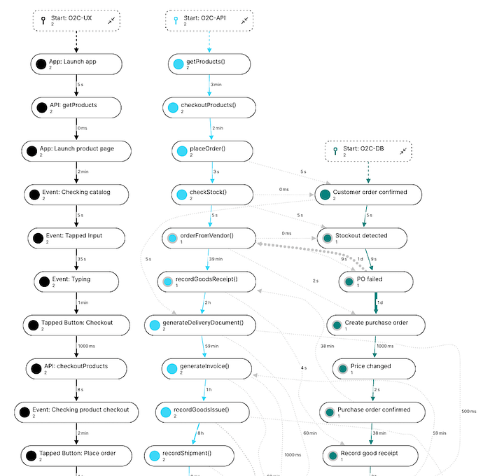
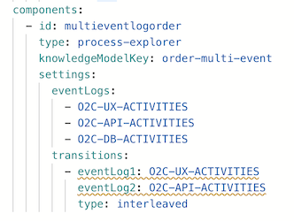
The view below illustrates how the O2C process can be visualized across the UX, API and DB layer — side-by-side. These multiple event model can be set using the built-in YAML editor to derive this composite view. So, through a single window, analysts will now be able to visualize an end-to-end view of the O2C process and understand how a transaction threads through the IT landscape.

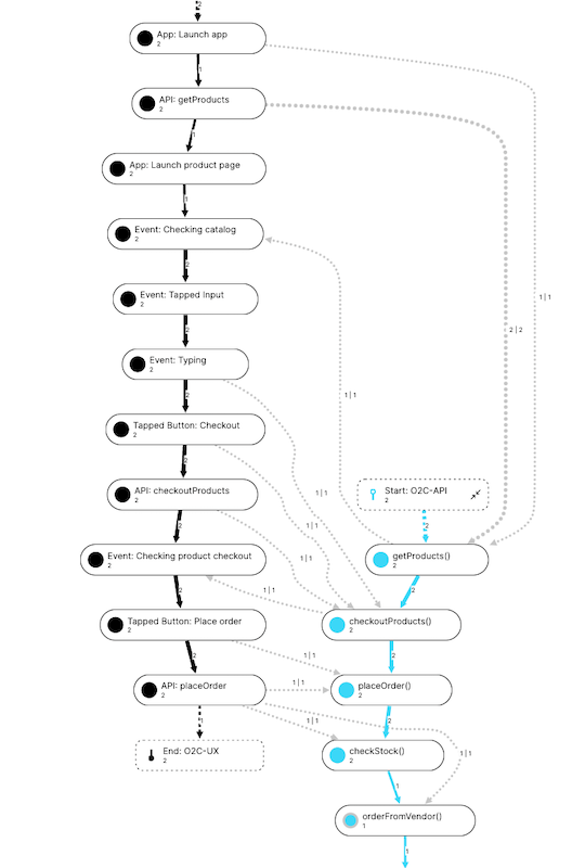
By introducing the “transitions” state in the YAML, the interactions between activities can be further analyzed across event logs. The example below illustrates the transitions and the activity interactions between the UX and the API layer. This is a gold mine of information for UX Design & IT teams.
It helps to analyze the end user experience based on the UX design, analyze the patterns on how APIs are invoked from the UI layer, API performance, determine if the application is chatty, # of hops, and so on.


Likewise, the analysis can also be instrumented to visualize the transition of activities between the API and DB logs — as seen below.

The anomalies like “PO failed” can be easily traced. In this case, I simulated a a B2B API (vendor API) failure that is used for creating a purchase order. The process model highlights, it required 1 day to fix the API outage (see the lead time between “PO failed” and “Create purchase order” activity). Further the new PO was raised with a “price change” as well. All these are vital information for both the business and IT. Using this approach, it’s a lot easier to trace the anomalies and start the root cause analysis.
Using the capability that Celonis extends to create KPIs & dashboards and applying a filter on this pattern (PO failed anomaly), the analysts an easily measure the business impact based on the pending orders to be fulfilled (see the Order value KPI).
Now, there are several ways to visualize process models. Instead of interleaved process visualization that was illustrated earlier, the event logs can be merged/consolidated into one singe model. Here is an example of the unified view with some sample KPIs to measure. The visualizations can be enriched by color coding the activities — in this case, the UX activities are highlighted in purple, APIs in orange and DB in blue.

The visualization is more linear, rather than the interleaved side-by-side view. This approach is very useful to measure the # of hops it takes to complete a process, identify rework, analyze the lead time by variance etc.
Using Celonis, both views can be modelled for users for analysis based on their preference, using the same set of the event logs.
“To achieve all this, proper log instrumentation is crucial”
Celonis requires 3 key attributes to map a process — (1) unique transaction reference, (2) what activity was performed and the (3) timestamp. It’s crucial to instrument the logs across all layers, so that these attributes can be ingested & transformed within Celonis to build the required process models. For example, the unique reference could be a GUID that is generated in the UI layer when the user originates the transaction.

In most implementations these attributes will be part of the de-facto log instrumentation design — helping to trace a transaction. So, this requirement is not something unique for process mining and existing logs could be leveraged to develop these process models.
To conclude, the multi-event process model extended by Celonis provides a birds-eye view of how a process is implemented within the IT app landscape. This provides a composite view for both the IT teams and Business teams to trace IT anomalies, analyze processes, measure the business impact and optimize for excellence. For IT organizations, who have a mature IT landscape and are in constant search for optimization & enhancements, this requirement will always feature in their top 5 list.
Thanks for reading and feel free to share your thoughts!
